TfL bike sharing

Visualizing excess monthly and weekly rentals of TfL bikes in London
We will us the TfL data from the London Datastore on how many bikes were hired every single day to analyse the average monthly and weekly deviation from a three year average. We use year 2016-2019 to calculate the comparable monthly and weekly three year average and then plot the actual monthly and weekly average from 2016-present against that comparable average line. We do this to analyze the difference between actual rentals and what was expected, hence we can get an understanding of how often demand exceeds supply or supply exceeds demand of bike rentals.
Load the data
We load the data from the website, clean the names and add new columns year, month and week.
url <- "https://data.london.gov.uk/download/number-bicycle-hires/ac29363e-e0cb-47cc-a97a-e216d900a6b0/tfl-daily-cycle-hires.xlsx"

# Download TFL data to temporary file
httr::GET(url, write_disk(bike.temp <- tempfile(fileext = ".xlsx")))
## Response [https://airdrive-secure.s3-eu-west-1.amazonaws.com/london/dataset/number-bicycle-hires/2021-08-23T14%3A32%3A29/tfl-daily-cycle-hires.xlsx?X-Amz-Algorithm=AWS4-HMAC-SHA256&X-Amz-Credential=AKIAJJDIMAIVZJDICKHA%2F20210912%2Feu-west-1%2Fs3%2Faws4_request&X-Amz-Date=20210912T134152Z&X-Amz-Expires=300&X-Amz-Signature=c354f9967235140f10aeea7b90983f70db404e33e4e9448842869777cfbf6ad9&X-Amz-SignedHeaders=host]
## Date: 2021-09-12 13:41
## Status: 200
## Content-Type: application/vnd.openxmlformats-officedocument.spreadsheetml.sheet
## Size: 173 kB
## <ON DISK> /var/folders/wl/zk4s6wj576qbqvz2hkwn0s_r0000gn/T//RtmpRC7i7s/file685860b37228.xlsx# Use read_excel to read it as dataframe
bike0 <- read_excel(bike.temp,
sheet = "Data",
range = cell_cols("A:B"))
# change dates to get year, month, and week
bike <- bike0 %>%
clean_names() %>%
rename (bikes_hired = number_of_bicycle_hires) %>%
mutate (year = year(day),
month = lubridate::month(day, label = TRUE),
week = isoweek(day))Monthly excess rentals
First, we focus on the monthly rentals and plot the excess rentals (expected-actual rentals) per month faceted by year.
As mentioned, we calculate the average per month from 2016-2019. We use this average as our expected rentals (blue line). Then we plot the actual rentals per month (black line) in comparison to that average. If the actual rentals exceeded the expected, meaning there was excess demand of bike rentals, we color the area of difference green. If there was excess supply, meaning that actual rentals fell short of what was expected, we color the area red. We do this using the geom_ribbon() function.
This coloring makes the graph more intuitive and readable, as you can see the excess or shortage of demand compared to what was expected with one glimpse.
# Calculate monthly bike change
monthly_expected_rentals <- bike %>%
  filter(year %in% c(2016,2017,2018,2019)) %>%
  group_by(month) %>%
  summarize(expected_rentals=mean(bikes_hired))

# Calculate actual monthly rentals mean
monthly_actual_rentals <- bike %>%
  filter(year %in% c(2016,2017,2018,2019,2020,2021)) %>%
  group_by(year, month) %>%
  summarize(actual_rentals=mean(bikes_hired))
## `summarise()` has grouped output by 'year'. You can override using the `.groups` argument.df <- inner_join(monthly_expected_rentals, monthly_actual_rentals) %>%
mutate(up = case_when((actual_rentals - expected_rentals) > 0
~ actual_rentals - expected_rentals,
(actual_rentals - expected_rentals) <= 0
~ 0),
down = case_when((expected_rentals - actual_rentals) > 0
~ expected_rentals - actual_rentals,
(expected_rentals - actual_rentals) <= 0
~ 0))## Joining, by = "month"# Create the graph
ggplot(df, aes(month, expected_rentals, group=1)) +
geom_line(color="blue") +
geom_line(aes(month, actual_rentals)) +
facet_wrap(~year) +
theme(axis.text.x = element_text(size = 5)) +
ylim(15000, 45000) +
#Filling of graph
geom_ribbon(aes(ymin=expected_rentals,ymax=expected_rentals+up),
fill="#7DCD85",
alpha=0.4) +
geom_ribbon(aes(ymin=expected_rentals,
ymax=expected_rentals-down),
fill="#CB454A",
alpha=0.4) +
theme_minimal() +
#Label the graph
labs(
title = "Monthly changes in TfL bik rentals",
subtitle = "Change from monthly average shown in blue
and calculated between 2016-2019",
caption = "Source: TfL, London Data Store",
x = "",
y = "Bike rentals") +
NULL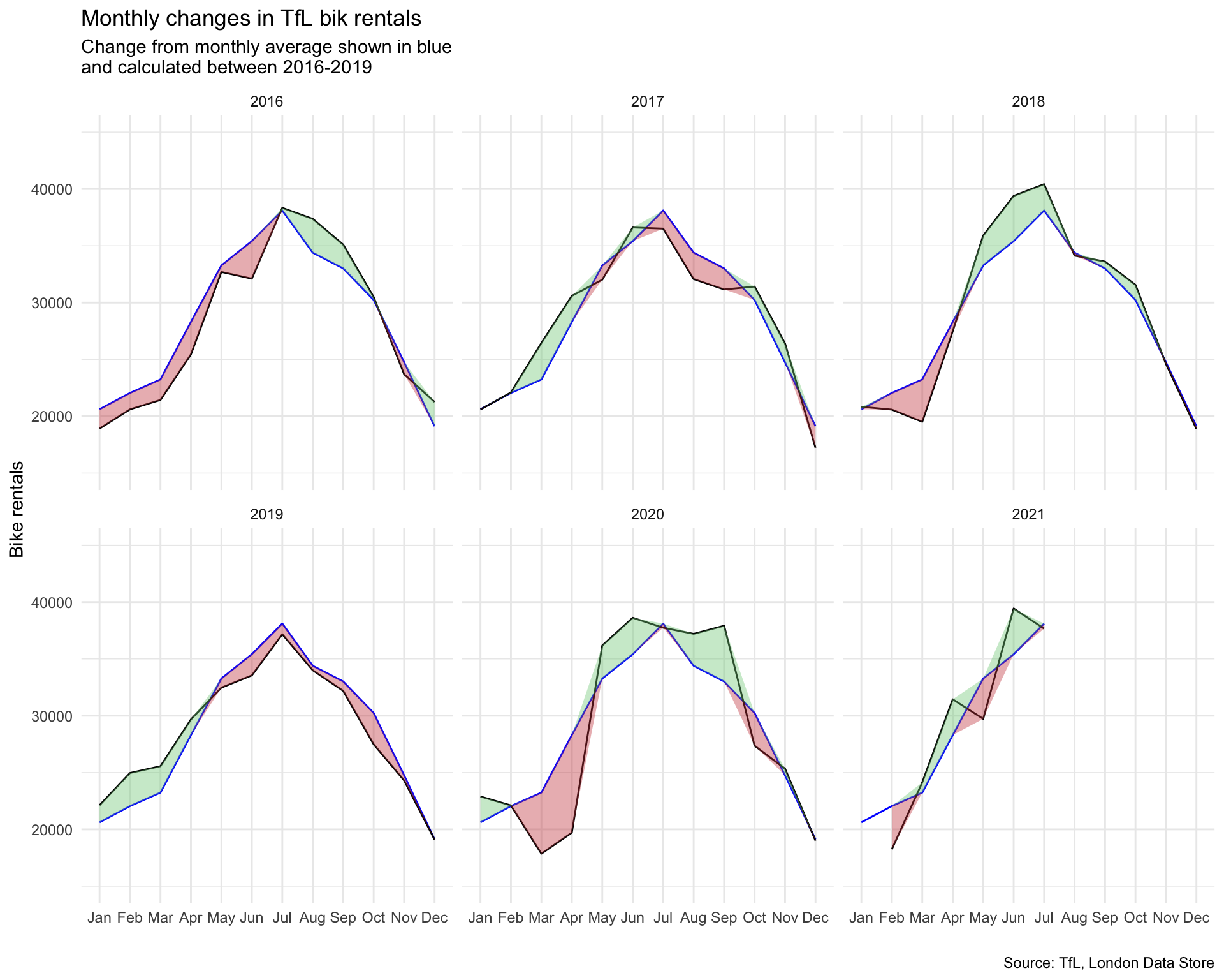
Weekly excess rentals
Secondly, we look at the weekly average rentals. Again we calculate the expected rentals per week using the average per month from 2016-2019. However, this time we calculate the percentage difference between the actual weekly rentals and what was expected instead of the total rentals.
In addition, we shade the graph background to signal the different quarters of a year using the geom_rect() function. As before we again use the geom_ribbon() to shade the area red or green depending if the given week exceeded or fell short of the expected bike rentals. To facilitate readability, we also add the colored dashed at the x-axis to indicate whether a specific week had excess or shortage of demand using the geom_rug() function.
# Calculate weekly bike change average
weekly_expected_rentals <- bike %>%
  filter(year %in% c(2016,2017,2018,2019)) %>%
  group_by(week) %>%
  summarize(expected_rentals=mean(bikes_hired))

# Calculate actual weekly bike change average
weekly_actual_rentals <- bike %>%
  filter(year %in% c(2016,2017,2018,2019,2020,2021)) %>%
  group_by(year, week) %>%
  summarize(actual_rentals=mean(bikes_hired))
## `summarise()` has grouped output by 'year'. You can override using the `.groups` argument.df1 <- inner_join(weekly_expected_rentals, weekly_actual_rentals) %>%
mutate(change = 100 * (actual_rentals - expected_rentals) / expected_rentals,
up = case_when(change > 0
~ change,
change <= 0
~ 0),
down = case_when(change > 0
~ 0,
change <= 0
~ change),
type = case_when(down == 0 ~ "up",
up == 0 ~ "down"))## Joining, by = "week"# Create the graph
ggplot(df1[1:292,], aes(week, change, group=1)) +
#Create gray background
geom_rect(aes(xmin=13,xmax=26),
ymin=-Inf,ymax=Inf, fill="#E5E7E9", alpha=0.035) +
geom_rect(aes(xmin=39,xmax=53),
ymin=-Inf,ymax=Inf, fill="#E5E7E9", alpha=0.035) +
geom_line() +
#Create filling between graph
geom_ribbon(aes(ymin=0,ymax=up),fill="#7DCD85",alpha=0.4) +
geom_ribbon(aes(ymin=0,ymax=down),fill="#CB454A",alpha=0.4) +
#Create tickmarks at the side and set their color
geom_rug(aes(color=type), sides = "b",
length = unit(0.04, "npc"), show.legend = FALSE) +
scale_color_manual(values = c("#CB454A", "#7DCD85"))+
#Facet, change theme and set scale
facet_wrap(~year) +
theme_minimal() +
scale_y_continuous(labels = c("-50%","0%","50%","100%")) +
scale_x_continuous(breaks = c(13,26,39,53),
labels = c("13","26","39","53")) +
#Label graph
labs(
title = "Weekly changes in TfL bike rentals",
subtitle = "%change from weekly averages
calculated between 2016-2019",
caption = "Source: TfL, London Data Store",
x = "week",
y = "") +
NULL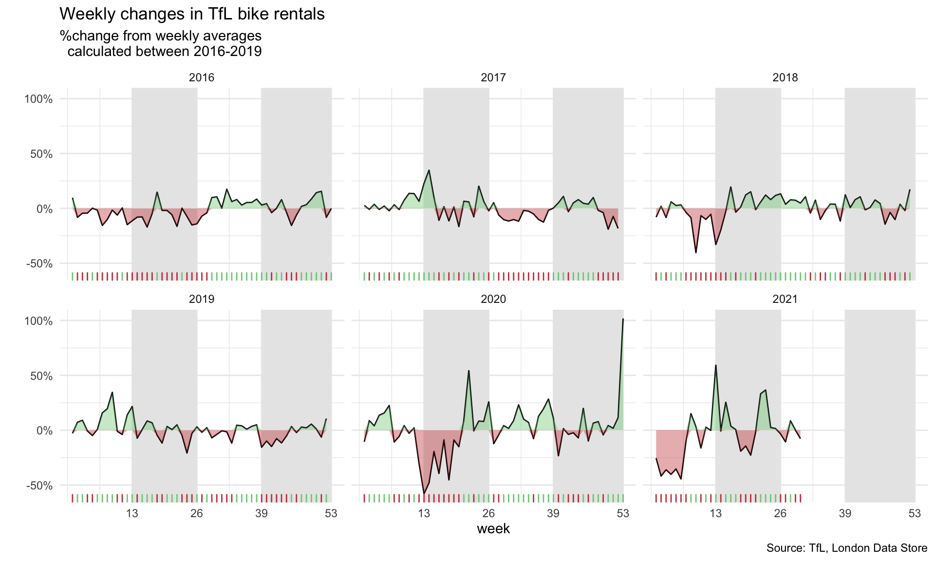
Observations
This graph makes it easy to see how much bike rentals fluctuate from the expected weekly over time. Especially year 2020 appears to deviate quite a lot from the average. In a few weeks, the bike rentals fell very short of what was expected. This time period from approximately calendar week 10 to 20 corresponds to the first lock down period of the Covid-19 pandemic. Given that most people stayed at home, it makes sense that people were reluctant to rent bikes. Then over the summer, as regulations loosened, many people were interested in spending time outside and a bike ride of course would be considered safer than taking the bus or the tube when looking at the risk of potential infections, so actual rentals actually exceeded expected rentals.