Political affiliation and Brexit voting
Analysis of Brexit voting results broked down by political affiliation
Using data manipulation and visualization skills, we use the Brexit results data to analyze the relationship between political affiliation and tendency of voting in favor of leaving the EU.
The data comes from Elliott Morris, who cleaned it and made it available through his DataCamp class on analysing election and polling data in R.
The main outcome variable (or y) is leave_share, which is the percent of votes cast in favour of Brexit, or leaving the EU. Each row is a UK parliament constituency.
Load the data and skim it
First we load the data and explore it to get a feeling for the different variables.
# Load data
brexit <- read_csv(here::here("data", "brexit_results.csv"))
## Rows: 632 Columns: 11## ── Column specification ────────────────────────────────────────────────────────
## Delimiter: ","
## chr (1): Seat
## dbl (10): con_2015, lab_2015, ld_2015, ukip_2015, leave_share, born_in_uk, m...##
## ℹ Use `spec()` to retrieve the full column specification for this data.
## ℹ Specify the column types or set `show_col_types = FALSE` to quiet this message.# Inspect data
glimpse(brexit)## Rows: 632
## Columns: 11
## $ Seat <chr> "Aldershot", "Aldridge-Brownhills", "Altrincham and Sale W…
## $ con_2015 <dbl> 50.592, 52.050, 52.994, 43.979, 60.788, 22.418, 52.454, 22…
## $ lab_2015 <dbl> 18.333, 22.369, 26.686, 34.781, 11.197, 41.022, 18.441, 49…
## $ ld_2015 <dbl> 8.824, 3.367, 8.383, 2.975, 7.192, 14.828, 5.984, 2.423, 1…
## $ ukip_2015 <dbl> 17.867, 19.624, 8.011, 15.887, 14.438, 21.409, 18.821, 21.…
## $ leave_share <dbl> 57.89777, 67.79635, 38.58780, 65.29912, 49.70111, 70.47289…
## $ born_in_uk <dbl> 83.10464, 96.12207, 90.48566, 97.30437, 93.33793, 96.96214…
## $ male <dbl> 49.89896, 48.92951, 48.90621, 49.21657, 48.00189, 49.17185…
## $ unemployed <dbl> 3.637000, 4.553607, 3.039963, 4.261173, 2.468100, 4.742731…
## $ degree <dbl> 13.870661, 9.974114, 28.600135, 9.336294, 18.775591, 6.085…
## $ age_18to24 <dbl> 9.406093, 7.325850, 6.437453, 7.747801, 5.734730, 8.209863…skim(brexit)| Name | brexit |
| Number of rows | 632 |
| Number of columns | 11 |
| _______________________ | |
| Column type frequency: | |
| character | 1 |
| numeric | 10 |
| ________________________ | |
| Group variables | None |
Variable type: character
| skim_variable | n_missing | complete_rate | min | max | empty | n_unique | whitespace |
|---|---|---|---|---|---|---|---|
| Seat | 0 | 1 | 4 | 43 | 0 | 632 | 0 |
Variable type: numeric
| skim_variable | n_missing | complete_rate | mean | sd | p0 | p25 | p50 | p75 | p100 | hist |
|---|---|---|---|---|---|---|---|---|---|---|
| con_2015 | 0 | 1.00 | 36.60 | 16.22 | 0.00 | 22.09 | 40.85 | 50.84 | 65.88 | ▂▅▃▇▅ |
| lab_2015 | 0 | 1.00 | 32.30 | 16.54 | 0.00 | 17.67 | 31.20 | 44.37 | 81.30 | ▆▇▇▅▁ |
| ld_2015 | 0 | 1.00 | 7.81 | 8.36 | 0.00 | 2.97 | 4.58 | 8.57 | 51.49 | ▇▁▁▁▁ |
| ukip_2015 | 0 | 1.00 | 13.10 | 6.47 | 0.00 | 9.19 | 13.73 | 17.11 | 44.43 | ▃▇▃▁▁ |
| leave_share | 0 | 1.00 | 52.06 | 11.44 | 20.48 | 45.33 | 53.69 | 60.15 | 75.65 | ▂▂▆▇▂ |
| born_in_uk | 0 | 1.00 | 88.15 | 11.29 | 40.73 | 86.42 | 92.48 | 95.42 | 98.02 | ▁▁▁▂▇ |
| male | 0 | 1.00 | 49.07 | 0.80 | 46.86 | 48.61 | 49.02 | 49.43 | 53.05 | ▁▇▃▁▁ |
| unemployed | 0 | 1.00 | 4.37 | 1.42 | 1.84 | 3.23 | 4.19 | 5.21 | 9.53 | ▆▇▅▂▁ |
| degree | 59 | 0.91 | 16.71 | 8.36 | 5.10 | 10.79 | 14.69 | 19.59 | 51.10 | ▇▆▂▁▁ |
| age_18to24 | 0 | 1.00 | 9.29 | 3.59 | 5.73 | 7.30 | 8.28 | 9.60 | 32.68 | ▇▁▁▁▁ |
Crete long format of data and plot
Next, we transform the data frame into the long format by assigning the party names to a new name Party. This makes it more efficient to plot the graph in the next step. We use scale_color_manual() to set the colors of the line and points to the official party colors. The official colors can be find using Google. We then adjust some remaining aesthetics of the graph such as changing the theme, setting the axis limits, and labeling the graph.
# Change to long format
brexit_long <- brexit %>%
  pivot_longer(cols=c('con_2015', 'lab_2015', 'ld_2015', 'ukip_2015'), names_to= "Party",
               values_to="Party_share")

# Plot graphs group/colour based on party
ggplot(data=brexit_long, aes(x=Party_share, y=leave_share, group=Party, colour=Party)) +

  # Set colour
  scale_color_manual(values = c("#0087dc", "#d50000", "#FDBB30", "#EFE600"),
                     breaks = c('con_2015', 'lab_2015', 'ld_2015', 'ukip_2015'),
                     labels = c("Conservative", "Labour", "Lib Dems", "UKIP"))+

  # Set transparency, smooth line, themes, and x/y axis
  geom_point(alpha=0.4) +
  geom_smooth(method=lm)+
  theme_minimal() +
  ylim(c(20,100))+
  xlim(c(0,90))+
  scale_x_continuous(breaks=c(0,20,40,60,80))+

  #Adjust legend and build border
  theme(legend.position="bottom",
        legend.title = element_blank(),
        panel.border = element_rect(color = "black",
                                    fill = NA,
                                    size = 1))+
  # Change labeling of graph
  labs(
    title = "How political affiliation translated to Brexit Voting",
    x = "Party % in the UK 2015 general election",
    y = "Leave % in the 2016 Brexit referendum",
    cex=0.1)
## Scale for 'x' is already present. Adding another scale for 'x', which will
## replace the existing scale.## `geom_smooth()` using formula 'y ~ x'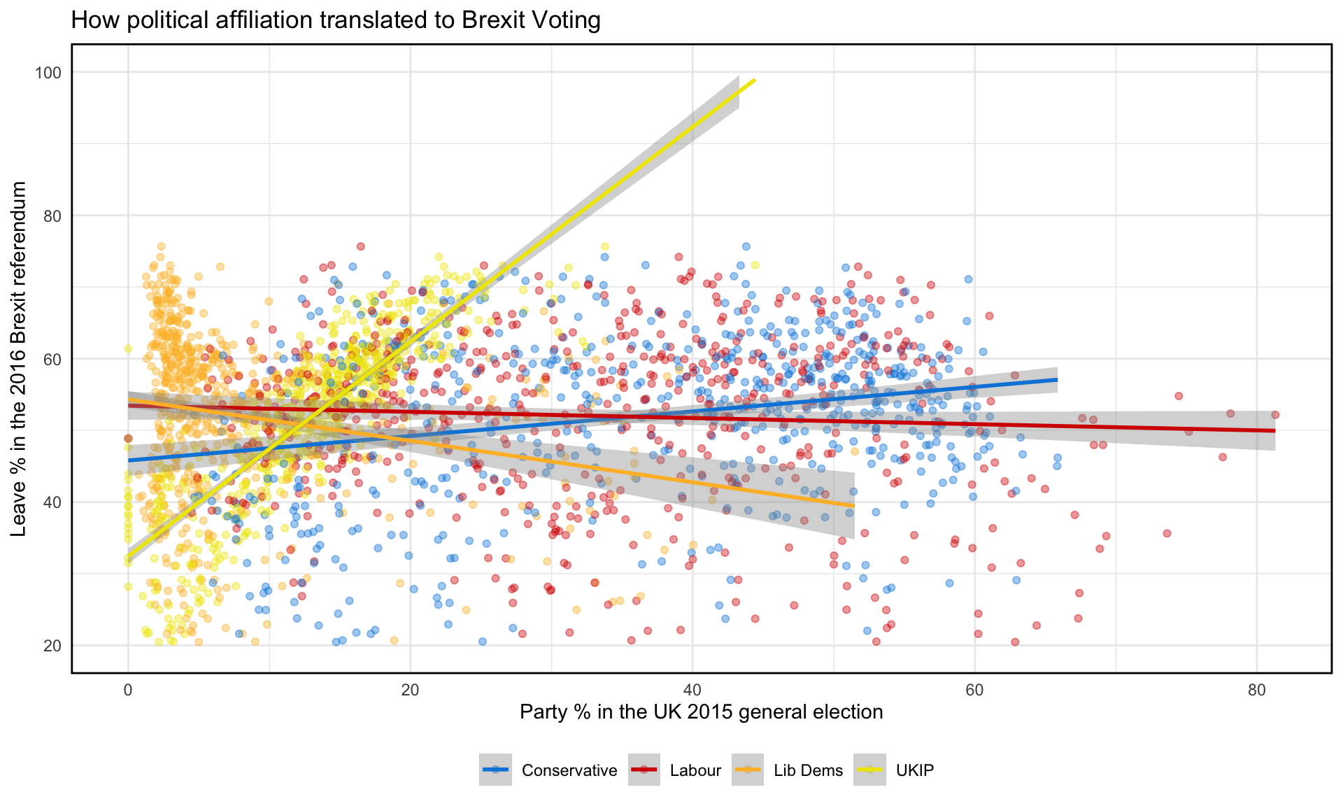
Observations
Looking at the graph, it is easy to see that the different political parties have different relationships with the percentage of leave voting in the Brexit referendum. For example, the percentage of UKIP in the general election appears to have a much stronger positive relationship, while percentage of Lib Dems in the general election appears to have a slight negative relationship to the percentage of leave voting. Hence, political party affiliation seems to be a valid indicator of likelihood to vote in favor of Brexit.